KitSZN: The Team Goes Green
Green is the theme this week, but what the USL has to offer is on full display
One of my favorite parts about soccer are the kits. As someone who has over 100 kits in his collection, and helps run a kit podcast - 4 seasons of rating kits, I figured I bring my thoughts to substack!
Each week we will highlight and talk about 5 kits from across the USL. Each kit is rated 1-5 based on four categories:
Design & Aesthetics
Authenticity & Tradition
Visual Details & Execution
Innovation & Impact
We then average the score between myself and my Co-Host Fox for our overall score. So without further ado, here are this week's kits:
Vermont Green: Yerba Madre Kit
If anyone is aware of Vermont Green, you know they always look phenomenal and rarely do they disappoint. Well 2025’s new home kit is arguably my favorite to date.
Starting off with a base of green, with white trimmings and polo collar, this kit is setup to be a pretty straight forward kit. But then I see the detail on the leafs. The crispness that Matt Wolff was able to achieve in this kit is a true testament to his talents.
You could really see the intricacy in every leaf. The more I look, the more I appreciate the detailing. Add in a polo, a simple white trimmings and you got yourself a kit that is stylish but isn't too loud. It's what I've come to expect from a Vermont Green home kit.
We’re thrilled to unveil our new home kit,” said Wolff. “The shirt is a deep green, with white trim and collar. The subtle print features vines and leaves, representing our club’s growth, and honoring our state’s public institutions, schools, town assemblies, and our cherished democracy.”
This is a quintessential Vermont Green kit and as such our score comes out to be: 4.63
Greenville Triumph: Unity Kit


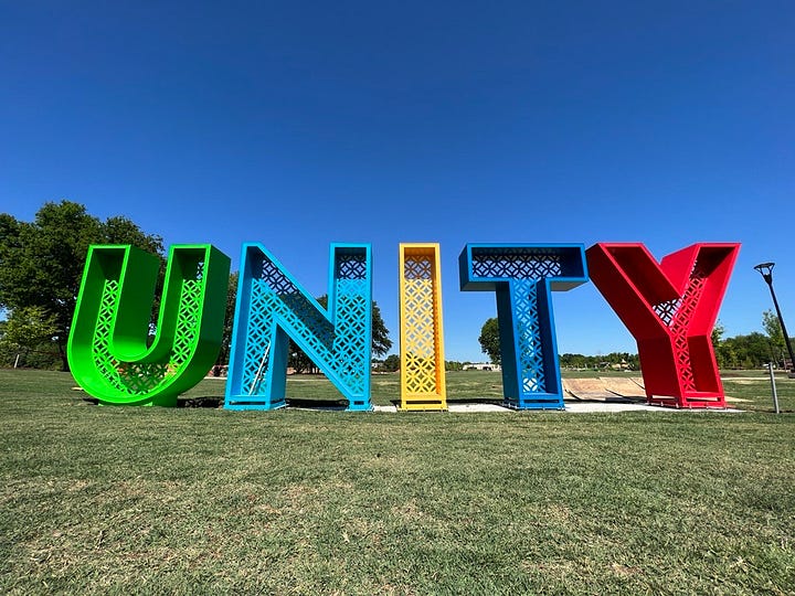
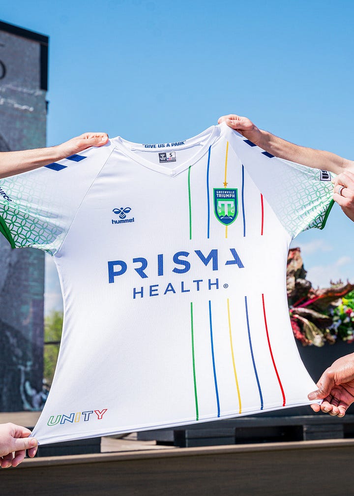
Inspired by Unity Park’s 9-foot table “Unity” sign, this kit attempts to recreate that icon but fails to stick the landing.
The signature pattern inside the letters appears on the jersey’s sleeves, fading in towards the cuff in Triumph SC’s primary green. The inside of the kit’s collar features early park advocate and reverend E.B. Holloway’s 1939 quote, “Give us a park”. Holloway’s efforts advocating for civil rights and the parks creation.
While the intention was there from Hummel, the overall execution missed in my opinion. This shirt just feels cluttered and not a cohesive design overall. I would have personally preferred to see that signature pattern in a little thicker stripes instead of fading on the sleeves.
I'm glad they took a shot and tried to incorporate their local history and monument - I learned so much doing this research - but this doesn't capture that. So because of that, our score comes out to be: 2.75
Pittsburgh Riveters: Blueprints Kit
Knowing what Charly has done for the Men's team put expectations high for the Riverters inaugural kits. I would say those expectations were met.
Per the official Shop:
“Drafted from the blueprints for WWII era aircraft that many Rosie's proudly worked on during the war effort! It brings together Pittsburgh with black and gold and 412 on back collar, the steel craft which pieced together movement for our soldiers and the influence Rosie's were in orchestrating it and making it happen! They faced many challenges and overcame, our Riveters will do the same and we hope our fans embrace the movement. RISE UP!”
From the get go, this kit stands out. You some see many (or any that I can recall) that have blueprint schema on it! While the collector in me loves that, I don't know if I quite like that aesthetic. Aside from my taste, this is a Pittsburgh sports jersey through and through. The base black kit with yellow sleeves quickly helps to identify this team has being from the Steel City.
Then add in the idea behind the blueprint, the work women of WW2 had in Pittsburgh and across the nation's factories, and this kit doesn't miss.
As a result of being true to Pittsburgh, this kit gets a score of: 4.38
FC Buffalo: The Ice Boom Kit


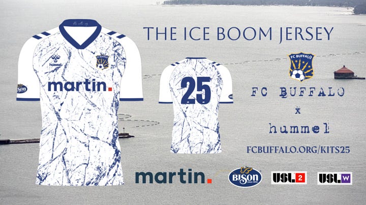
Buffalo certainly leaned into what it's known for - being ice cold. The team from Upstate New York always does it's best to visually represent their city and this is another example.
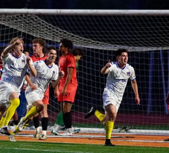
Yes this is a simple white kit with a blue design. However, the detail of the shattered ice plus the sharpness of that blue on the white looks amazing. Add in the yellow socks and this kit does it's job while Buffalo is on the road.
The Ice Boom Kit achieved it's goal: being a solid away kit that is a nod to the frigid temperature many in Buffalo face during winter. This brings our score to: 3.38
Official Shop: Pre-Sale Over as of 6/16/2025
Richmond Ivy: Mint Kit
Much like Vermont, the Richmond Ivy have always looked good. From the unique color pallette and creative ties to the community - the Ivy are always looking to out due themselves.
This year may have been a slight regress in the kit world but this is still a fantastic kit overall. The 4 different shades of green plus the iconic ivy look really sharp. The cartoonish feel the vine gives us makes this a more light and playful adaptation of leaves compared to Vermont.
The little white in the collar helps tie this kit together. This little part helps focus our attention on the greens on the sides while also not adding in anymore green. Throw in an alternative badge and the Ivy have once again done well. I just ask to bring back the orange for accents :)
The Ivy stuck to their tradition and gave us another great ivy inspired kit. We gave this a score of: 4.19
You can catch the full episode here on Spotify or YouTube:
Let me know your thoughts on how we did in the comments below!
Please let me know if you want to see more content like this!


As someone who can appreciate a kit, my biggest scoring factor is...can I read the numbers on the back when the camera angle is atrocious watching a game live.
As someone who doesn't always have time to watch the full KitsSZN episodes on youtube this writeup it wonderful. Looking forward to future installments.